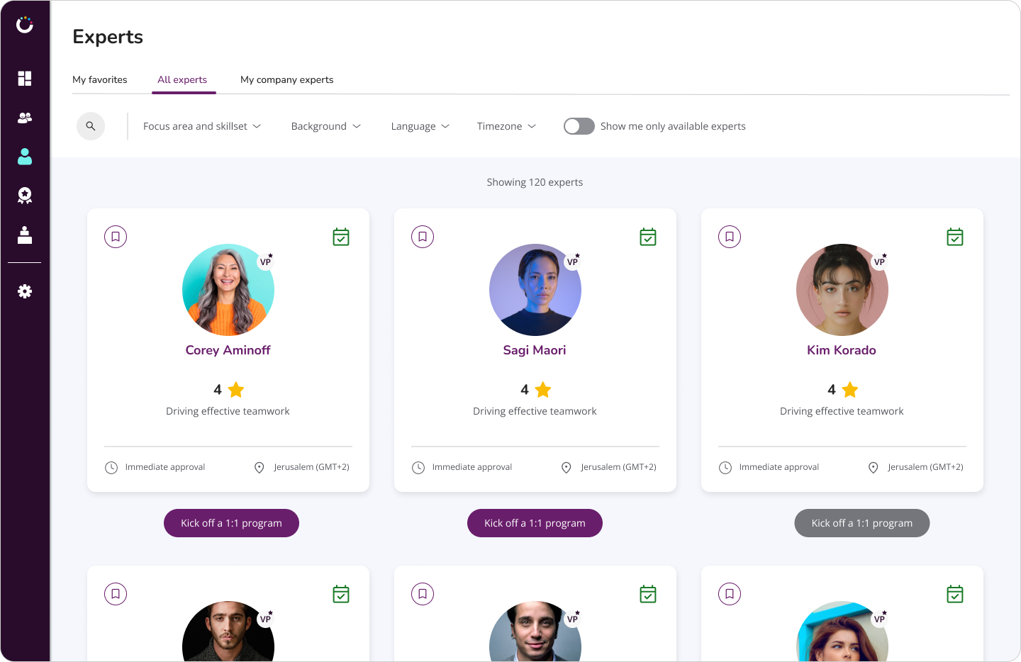
Growthspace Redesign
We conducted an internal rebranding of the GrowthSpace platform after realizing that the existing color scheme and typography did not effectively reflect the company's core values of growth. Additionally, the platform itself required a design upgrade to improve consistency and create a more cohesive user experience.
Understand the problem
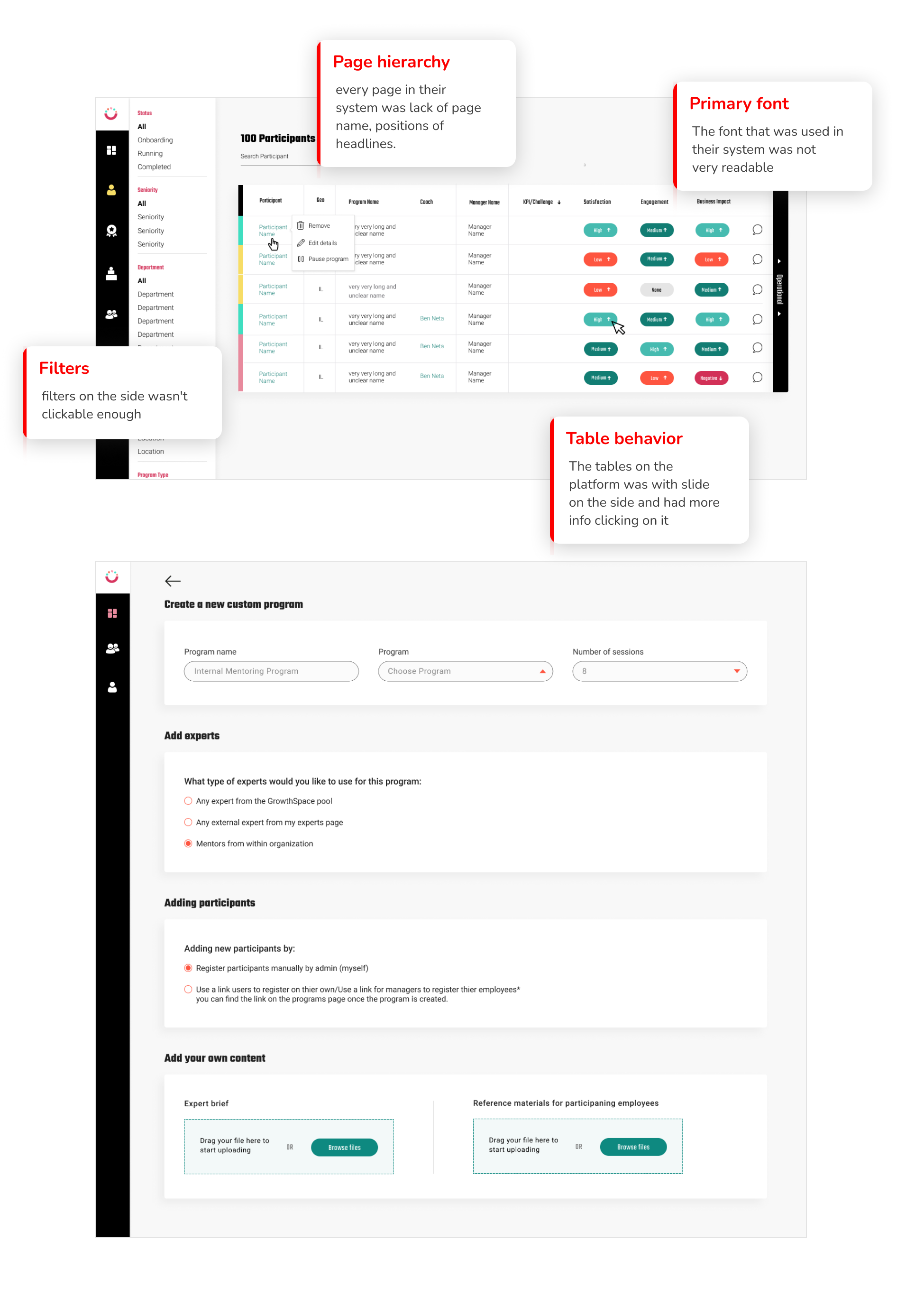
When evaluating the GrowthSpace platform, we identified key misalignments between its visual identity and the company’s core values. The existing color scheme and typography did not effectively communicate the essence of growth, innovation, and professionalism.
Beyond aesthetics, the platform itself lacked design consistency, leading to an inconsistent user experience. This fragmentation made navigation less intuitive and reduced overall engagement.
Recognizing these challenges, we set out to refine the platform’s design language to better reflect GrowthSpace’s mission while enhancing usability and coherence.
The Re-design
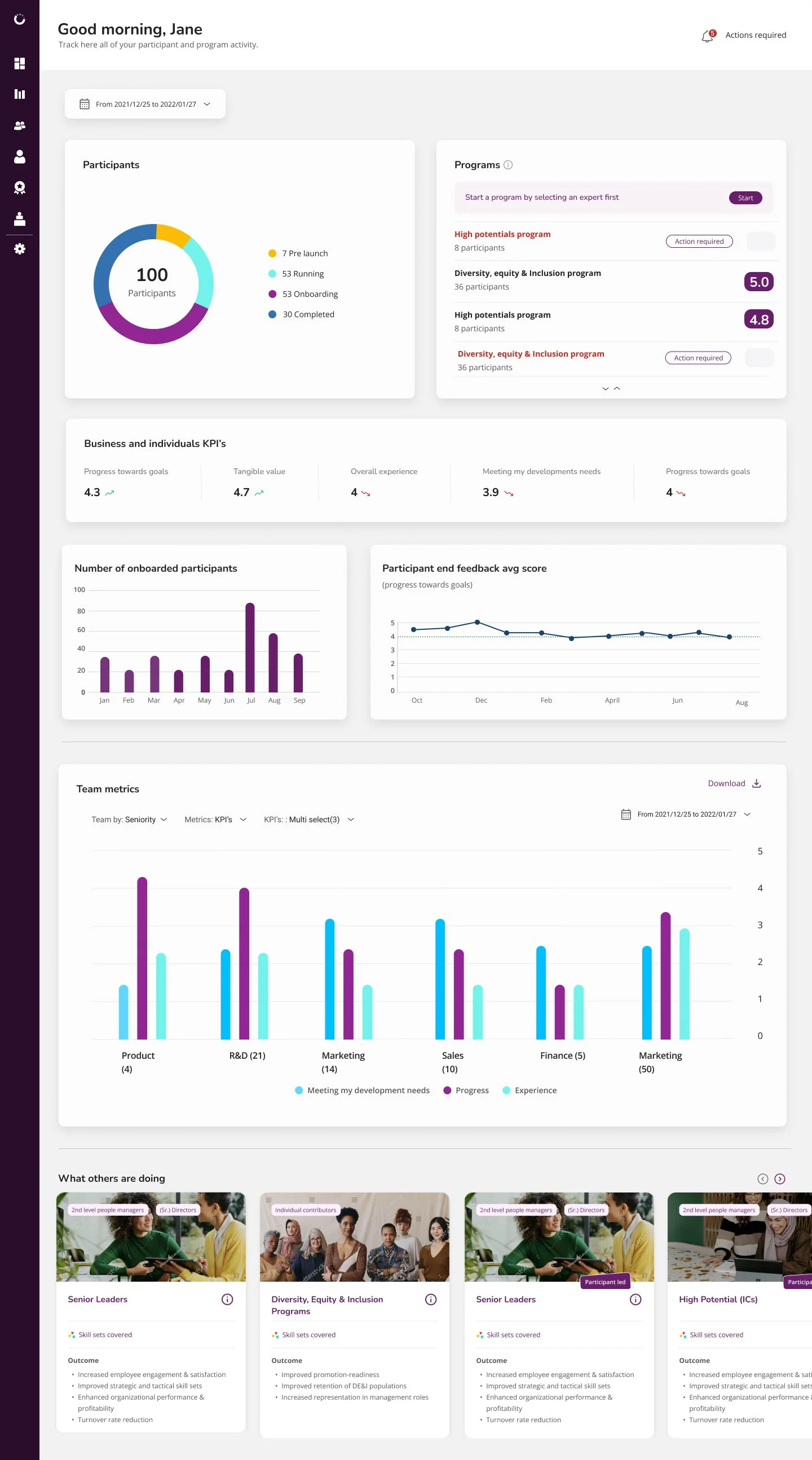
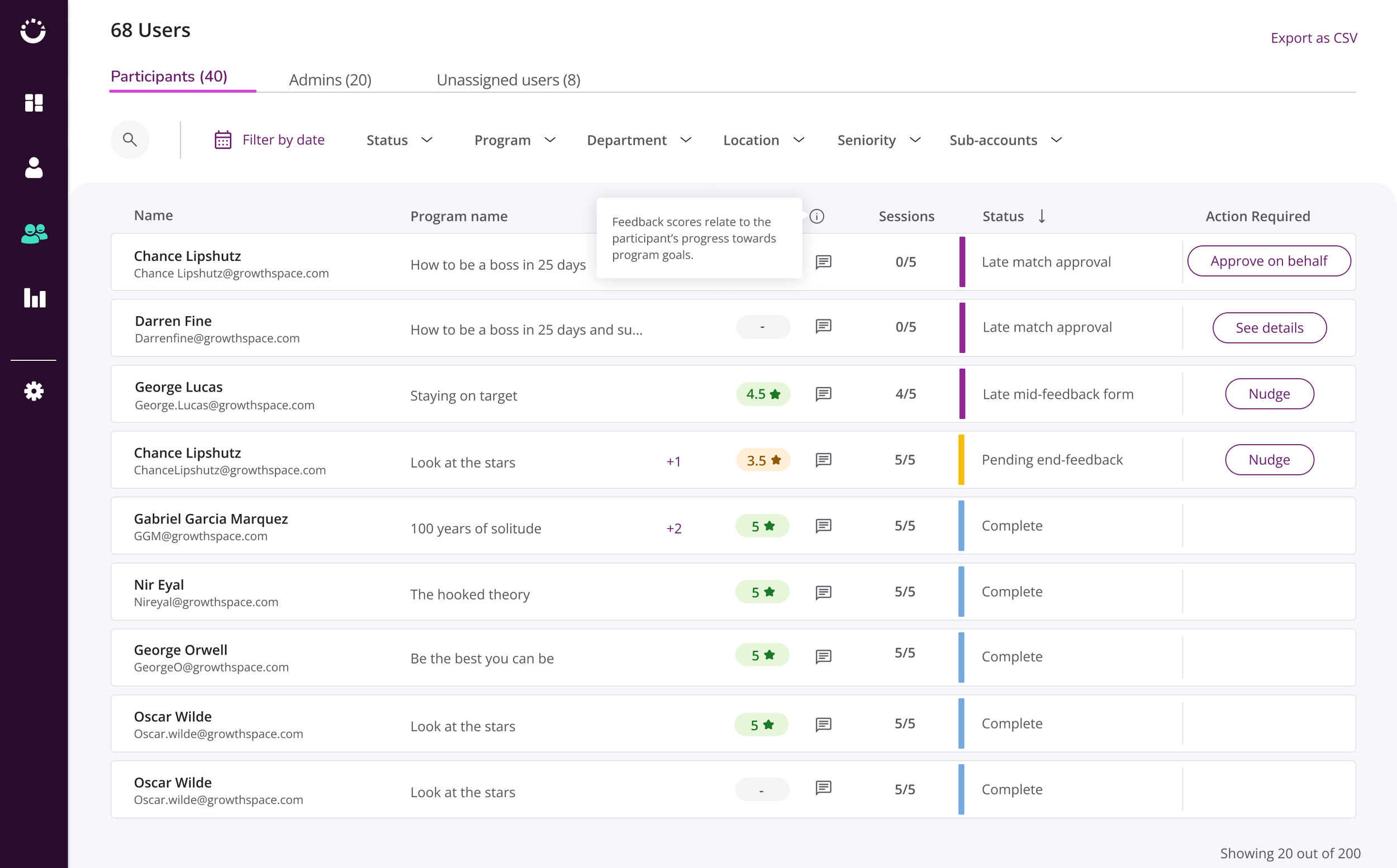
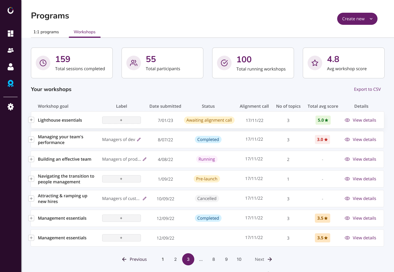
To align the platform’s identity with GrowthSpace’s values and target audience, we implemented a refined design approach:
A deeper purple color palette – Strengthening the connection to HR while maintaining a sense of professionalism and trust.
Rounded typography – Creating a more approachable and modern feel that enhances readability.
Behavior based on best practices – Ensuring intuitive interactions and a seamless user experience by following industry standards.
This redesign not only improved visual coherence but also reinforced GrowthSpace’s brand identity in a way that resonates with users.

